Project Case Study
K&S Insurance
Rockwall, TX
Services Provided
- Brand Audit & Strategy
- Logo Redesign
- Website Redesign
- Visual Brand Development
- New Print Pieces & Signage
- Print Design/Execution
- SEO Audit & Strategy
- Social Media Audit & Strategy
- Established Brand Messaging
- Performed Audience Research
About K&S Insurance
K&S Insurance is a commercial insurance provider headquartered out of Rockwall, TX with offices in El Paso, Lubbock, and Leander. With 40+ years of experience and dozens of trusted advisors, K&S is a leader in the commercial insurance space.
The team at K&S was great to work with. They were genuinely passionate about serving their clients and providing them with solutions to their problems. Through multiple meetings and employee interviews, we helped K&S discover and verbalize five core values that guide them. We call them their Promises: build lasting relationships, do what’s right, help others win, give back generously, and always be learning. This new language has helped their unite their employees, and provided inspiration to their customers. We’re grateful for the opportunity to partner with K&S to better tell their brand story.
Logo Process & Redesign
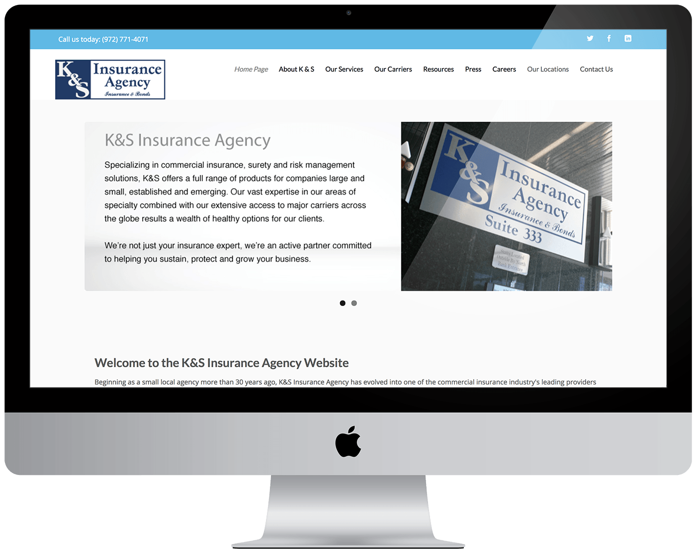
The original K&S logo (seen to the right), was dated and rigid. It lacked personality and failed to accurately tell the K&S story. Additionally, there were several different variations of this logo floating around on signage and print pieces that resulted in some brand confusion for their customers and stakeholders. Check out the original logo to the right and our revised version below.

Original Logo
In addition to simplifying their brand, we wanted to create a mark that more accurately portrays their organization. The logo is comprised of a “compass” icon and a word mark. The compass represents the idea that K&S doesn’t just help their customers avoid risk, they actually help them navigate risk while guiding the organization to the best insurance solutions. The green in the color palette stands for growth. K&S partners with their clients to help grow and enhance their businesses.

Final Primary Lockup & Logo Icon
Website Redesign
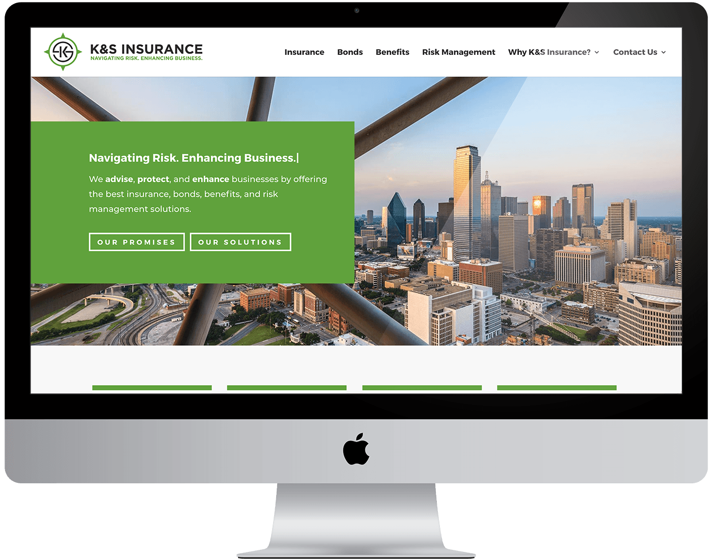
A huge goal for the new K&S website redesign was to drastically improve navigation and usability. We clearly structured the website into the four services they provide and utilized the strong messaging that we had created for them. The result was a powerful website that is easy to navigate and looks great. We also made everything mobile-friendly so the new website looks just as great on mobile as it does on desktop. Check out the full site by clicking here.
Print Collateral
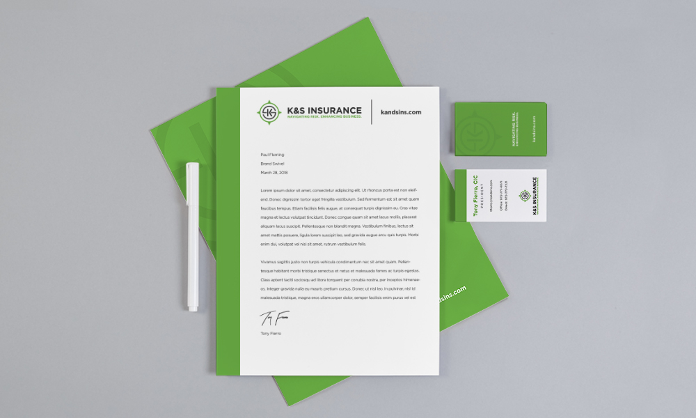
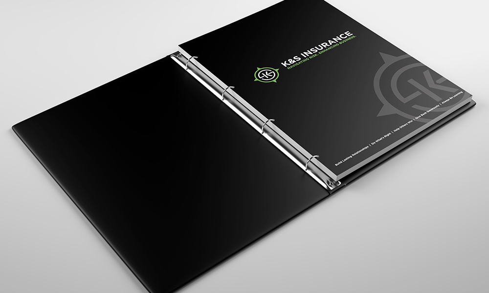
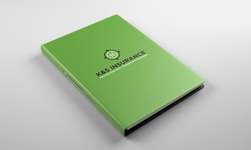
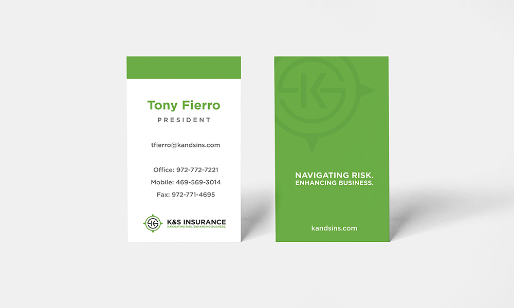
In addition to the logo and website, we also had the opportunity to provide K&S with several new pieces of print collateral for their new brand, including: letterhead, business cards, thank you cards, envelopes, binders, folders, mailing stickers, and branded polos and vests for their staff. We designed and printed each of these pieces for K&S.

“Brand Swivel helped our organization realize its full potential. Over several strategic interviews and exercises, they literally defined our “why” by the questions asked. in addition to the new branding, they were also a one stop shop for our marketing needs, such as our website, graphic design and all print collateral. This allowed everything to flow and tie together with our new brand.”
Tony Fierro, President – K&S Insurance

