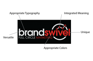
If there’s one thing that is most important for brands, it’s their logo. Your logo is pretty much the first visual thing potential clients and customers will see that will reflect your company. Believe it or not, many people do get a certain feeling or vibe about your company just by looking at your logo. This is a combination of the color and design, so when you’re in the process of designing your logo, be sure you know every element of it to give off the right vibe.
Take a look at a few important aspect of your logo you should know as it’s being worked on…

Unique Idea
A major thing to be sure of when designing a logo is to make sure it’s original. Originality means it’s valuable. Being valuable means that it will stand out from your competitors as well as other businesses. If you compare all of the top logos from brands, you will see that they are all different and unique in their own way. They really “feel” like the company.
The idea behind the logo is also very important. This is the way that a logo designer can transform the name of a company into a visual concept. It’s brilliant when you really think about it and when it’s done right, you’ll be amazing. Many times people will see the finished product and think “why didn’t I think of that!?” However, this is what designers are for, to bring those ideas and concepts to life.
Letterforms / Appropriate Typography
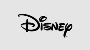
A great style of logo is in letter form. Take brands such as Coca-Cola, Kellogg’s and Disney. All of their logos are made up in letter form, where the font looks like a signature of hand-drawn letterform. For logos such as these, particular attention is required to keep the individual letters consistent in some way such as keeping a similar baseline, x-height, angle or down stroke thickness. Take a look at Disney’s below for an example.

Iconography / Integrated Meaning
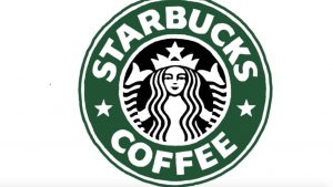
Some logos have both the name of the company and a graphic in. The icon of a logo is a symbol that can be used with or without the wordmark. For well-established brands, the icon may be the only thing that is needed in order for the brand to be recognized. Take Starbucks, for example, that is a great representation of an iconographic logo.

Legibility / Versatile
Another extremely important aspect of your logo is the legibility and versatility. If you have your name in the logo, is it legible? Is it read easily in order for consumers to understand who the business is and how relevant it is to them. Can it be read in all contexts (versatility). For several businesses, the selected font used for a logo should reflect upon the brand’s personality. If it’s to legible, this can turn consumers away from your brand.
Are you looking for a logo designer for your business?
if you’re on the hunt for the right designer to create the perfect logo for your company, contact us today for a consultation!

